Analysis Overview
After completing your evaluation, you can analyze the results through various charts and metrics. The analysis dashboard provides comprehensive insights into your evaluation data. Want to see these analysis features in action? Check out our sample evaluation analysis to explore a real-world example of how these charts and metrics come together.Mean Score Analysis
Single Evaluation Charts
Mean Scores by Model
View the average scores for each model in your evaluation through a bar chart visualization.
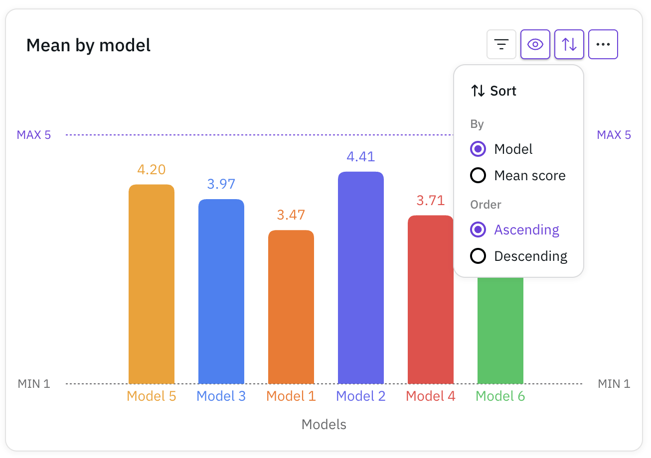 This chart helps you quickly compare the performance across different models.
This chart helps you quickly compare the performance across different models.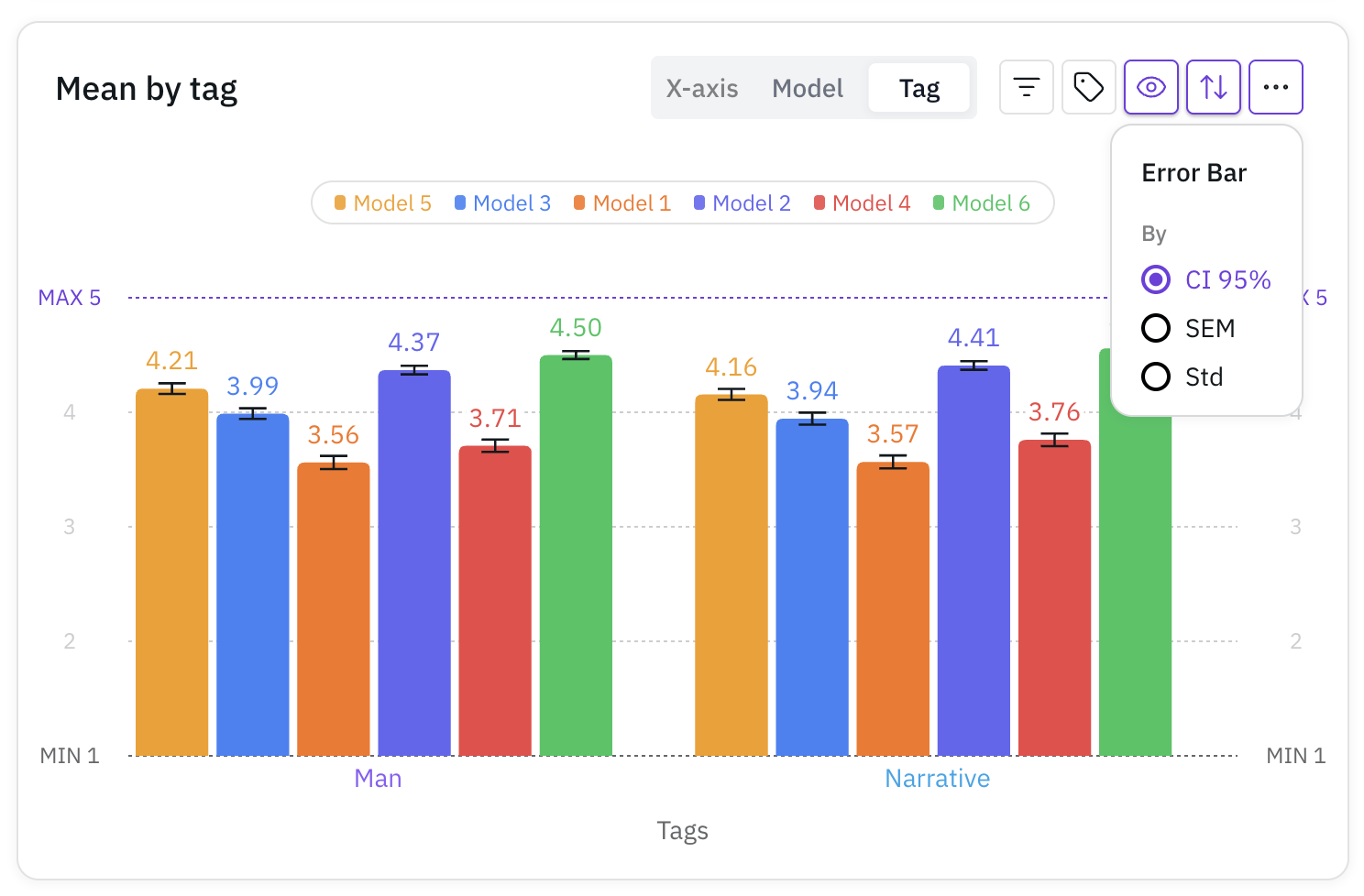
Double Evaluation Charts
Comparative Mean Scores by Model
For comparative evaluations, see which model was preferred in direct comparisons.
 This chart shows the preference distribution between Model A and Model B.
This chart shows the preference distribution between Model A and Model B.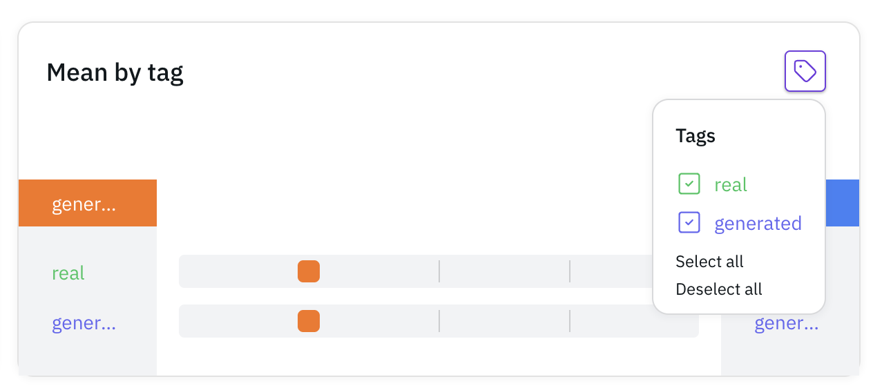
Detailed Analysis
Response Distribution
Answer Frequency by Model
See how responses are distributed across different models.
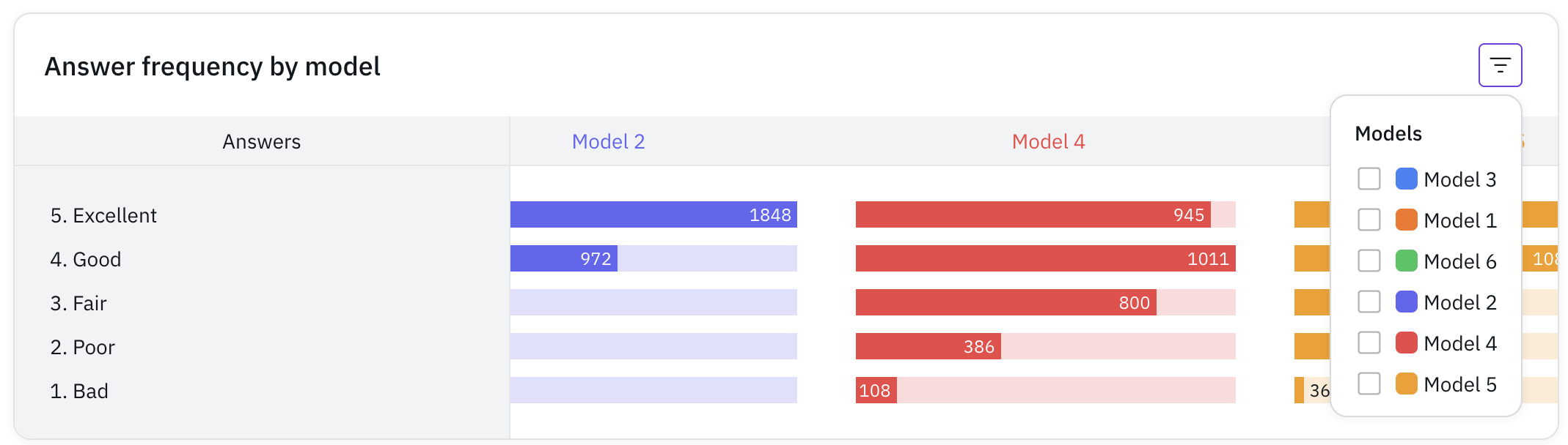 This horizontal bar chart shows the frequency of each response option per model.
This horizontal bar chart shows the frequency of each response option per model.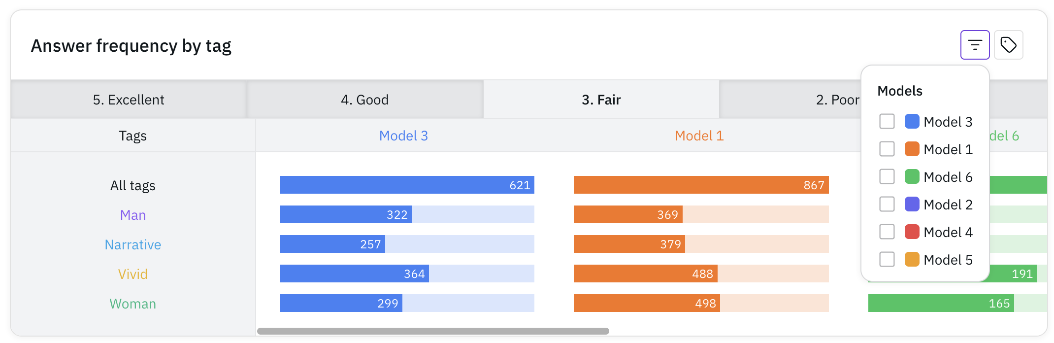
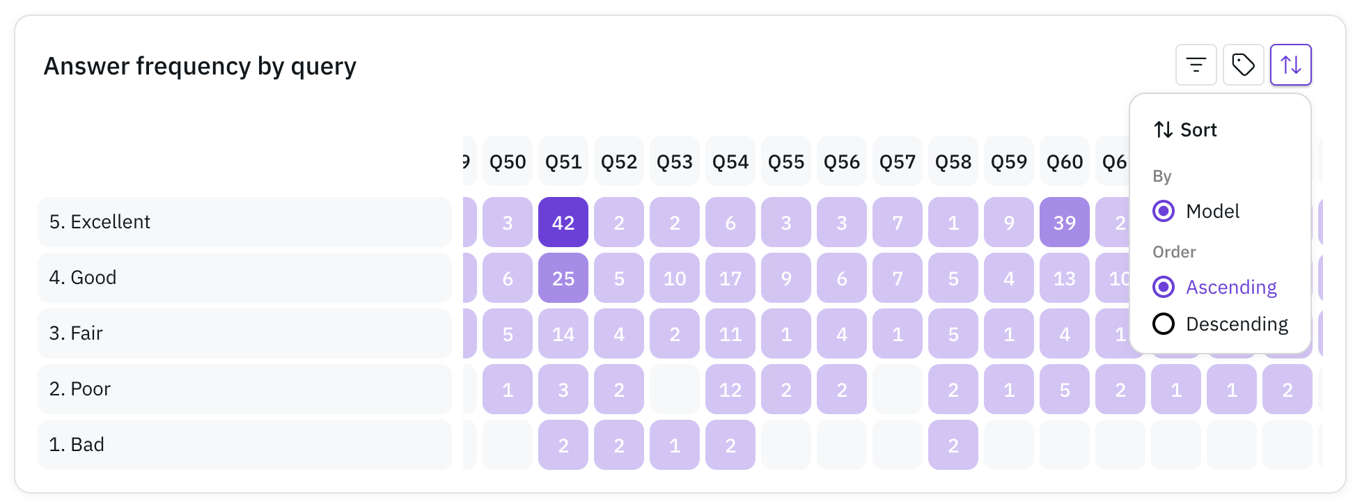
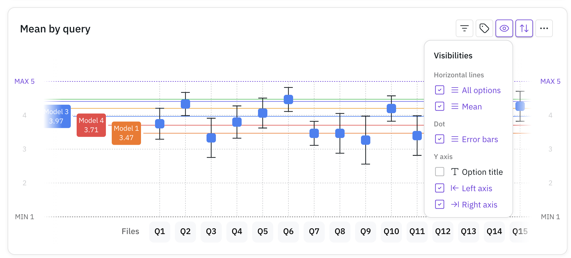
Query-Level Analysis
Query Summary
View a comprehensive list of all quries with their:
- Associated models
- Tags
- Mean scores
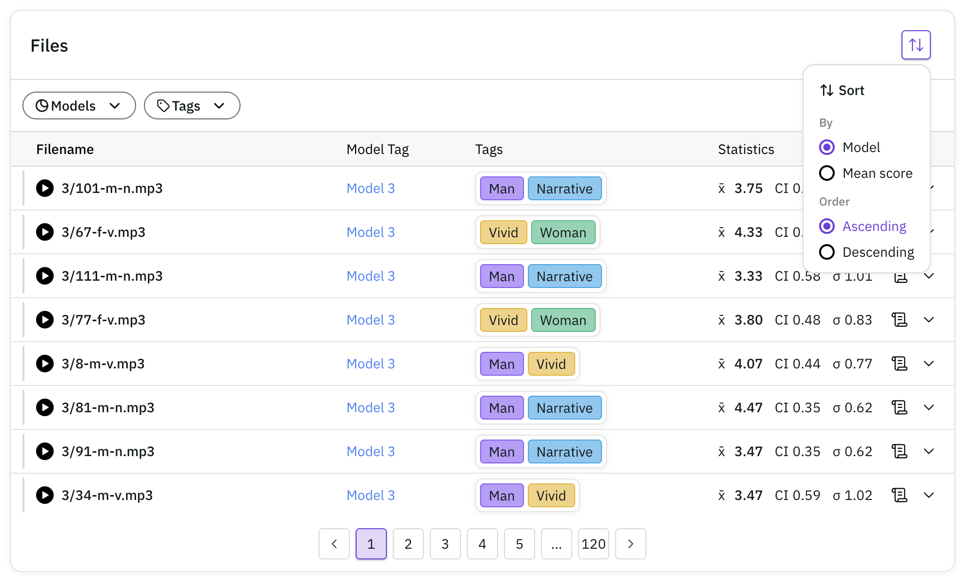
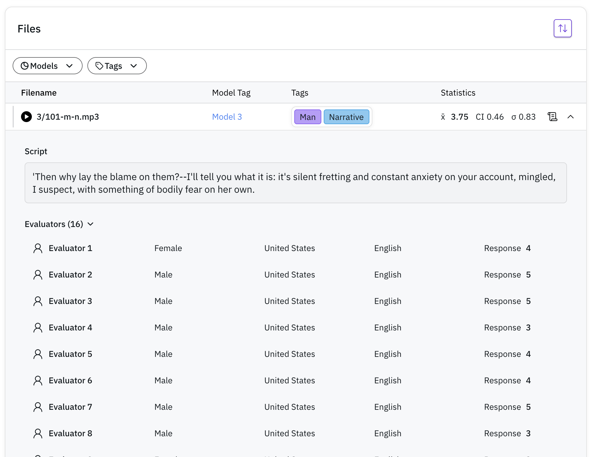
Query Details
Access detailed information about each evaluated file:
- Individual responses
- Evaluator demographics (nationality, gender)
- Associated script (if available)
Pro Tip: Make the most of your analysis by utilizing tags effectively. Tags allow you to slice and dice your data in various ways, providing deeper insights into specific aspects of your evaluation. Consider adding tags for characteristics like:
- Speaker demographics (gender, age group)
- Audio characteristics (noisy, clean)
- Content type (question, statement)
- Any other relevant categorization